
An onboarding funnel is easy to draw and surprisingly easy to get wrong. Signup becomes profile setup, profile setup becomes an integration, and the last box gets labeled “activated.” The report looks tidy. The users rarely behave that way.
Some skip optional steps. Some leave to find a credential. Some finish the checklist without reaching the product’s value. Others appear to abandon onboarding when the real failure is a request that timed out after they pressed the right button.
Useful onboarding funnel analytics must answer three separate questions:
- Where did the user stop making progress?
- What did the user experience at that point?
- Did completing the flow lead to meaningful product use?
If the report cannot answer all three, it measures choreography rather than onboarding.
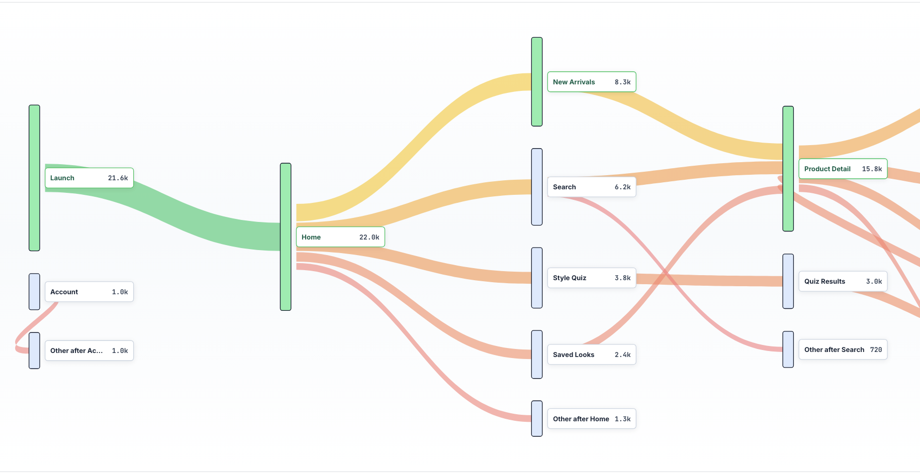
Define activation before defining the funnel
The final onboarding screen is not automatically an activation event. Activation is the first action that demonstrates the product’s value to the user.
For a monitoring product, installing an SDK may be necessary, but seeing the first captured session is closer to activation. For a collaboration product, creating a workspace is setup; inviting a teammate and completing a shared action may be activation. For a finance app, linking an account is setup; successfully categorizing or reconciling a transaction may be the first value moment.
Write the activation definition in plain language before naming events:
A new account is activated when it has completed the minimum setup and received the first useful result.
That sentence prevents a common analytics failure: optimizing the easiest step to count instead of the outcome that predicts continued use.
Measure four rates, not one completion number
An overall completion rate hides where the work is. A better onboarding report keeps four measures visible.
| Measure | Formula | What it reveals |
|---|---|---|
| Step completion | users completing a step / users entering it | The local leak between two steps |
| Overall completion | users finishing onboarding / users starting | Whether the designed flow is being completed |
| Activation rate | activated users / eligible new users | Whether users reached real value |
| Time to value | time from eligibility to activation | How long value remains delayed |
The distinction between completion and activation matters. If checklist completion rises while activation stays flat, the checklist may have become easier without making the product clearer. If activation rises while formal completion falls, users may have found a better path than the one the team designed.
Track both outcomes instead of forcing every user into one sequence.
Build the funnel from product states
Page views make weak onboarding steps. A route can load without the user understanding it, and a component can emit an event before the underlying action succeeds.
Prefer states that prove progress: account_created; workspace_named; integration_verified; first_data_received; first_result_viewed; teammate_invited; and activated.
For each state, capture the timestamp, session identifier, platform, release, plan or persona when appropriate, and the result of the action. A click on “Connect” is not the same as a verified connection.
Optional steps should not break the funnel. Model them as branches or attributes. Otherwise, a user who skips a tutorial and reaches value quickly will be reported as a failure.
Diagnose the failed onboarding transition
Suppose the largest drop is between integration_started and integration_verified. The screen with the integration form will attract attention, but the leak can begin earlier or end later.
Review sessions from three populations: users who started and verified the integration; users who started but did not verify it; and users who never started despite reaching the preceding step.
The comparison exposes different problems. Non-starters may not understand why the integration matters. Starters who fail may have credential, permission, API, or validation problems. Successful users show the healthy path and the amount of effort the step normally requires.
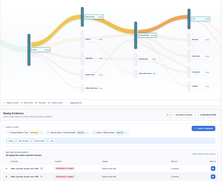
This is where replay changes the quality of the analysis. The funnel identifies a transition. Replay shows whether the user hesitated, retried, scrolled past an explanation, encountered a silent error, or left to retrieve information.
Separate UX friction from technical failure
Onboarding teams often rewrite copy for what is actually an engineering problem. Engineering teams often fix an error that still leaves the step confusing.
Use a simple evidence split:
| Evidence in the failed sessions | Likely first investigation |
|---|---|
| Repeated taps with no state change | Dead control, slow response, or unclear feedback |
| Validation errors after reasonable input | Form rules, formatting, or error copy |
| Request failures or long latency | API, permissions, provider, or connectivity |
| Back-and-forth navigation | Missing prerequisite or poor information order |
| Long pause followed by exit | Unclear value, trust concern, or external information needed |
| Crash, freeze, or ANR | Release, device, memory, or native stability |
One session is not enough to assign a cause. Look for the pattern across the failed population, then compare it with successful sessions from the same device, release, acquisition source, or role.
Segment only when the segment can change the decision
Onboarding dashboards can become a wall of filters. Start with segments that can plausibly alter the experience: web versus mobile; app version or release; device and operating system; persona or role; plan or trial type; acquisition source; and new workspace versus invited user.
Do not split the report simply because a property exists. A useful segment tells you who needs a different flow or where a defect is concentrated.
For example, a low completion rate among invited users may mean the flow incorrectly assumes they are workspace owners. A mobile-only drop after a permission prompt points to a different fix than a global decline after pricing is shown.
Watch time between steps
Step conversion can remain stable while the experience degrades. If users still finish but take three times longer, the funnel is leaking attention and confidence before it leaks completions.
Track median time between steps and a high percentile such as p90. The median describes the typical path; the tail surfaces users who wait, loop, background the app, or recover from errors.
Be careful with long gaps. A user who returns the next day may have chosen to pause, or the product may have failed to establish urgency. Replay and session boundaries help distinguish the two.
A weekly onboarding review that produces decisions
A practical review does not need dozens of charts. Bring this sequence to the meeting:
- Overall activation rate and time to value
- The two transitions with the most lost users
- Change by release, platform, and meaningful persona
- A small set of failed and successful sessions for each transition
- Technical signals attached to those sessions
- One proposed fix and the metric that will verify it
The output should be a falsifiable statement: “New mobile users on version 4.8 fail verification because the success response arrives after the UI timeout,” or “Invited analysts leave before connecting data because the copy addresses workspace owners.”
That is much more useful than “step three has 42% drop-off.”
Replay the step where onboarding stalls
Rejourney connects each onboarding transition with the users and sessions counted in it. Open the failed branch, compare it with successful users from the same role or release, and inspect the request or interface state at the moment the paths diverge.
For mobile-specific handoffs and permission prompts, use mobile app onboarding analytics. The activation metrics guide helps define the outcome at the end of the funnel.