
A heatmap is useful only when it tells you something surprising
The weak version of heatmaps is a pretty red overlay that proves people clicked buttons. Useful heatmaps answer a harder question: did users notice the copy, controls, layout, and page sections that were supposed to guide them?
Mobile touch maps are still valuable for repeated taps, dead zones, thumb reach, and controls that look interactive but are not. They become noisy when every obvious button is treated as an insight.
Web attention maps can go further because web pages have scroll depth, viewport exposure, reading patterns, pointer movement, and dense content. They can show a skimmed hero, an ignored docs warning, or a pricing block that absorbed attention before conversion.
Separate attention from interaction
A hot button is usually not a discovery. Buttons are supposed to get touched. The more useful heatmap question is whether users noticed the content and controls that were meant to guide the next action.
Use attention maps for web pages where copy, layout, scroll depth, and content exposure matter. Use touch maps for mobile screens where taps, repeated taps, reachability, and dead zones matter. Mixing the two creates confident but sloppy conclusions.
- Use attention maps for docs, pricing, onboarding, checkout, settings, and content-heavy web pages.
- Use touch maps for repeated taps, dead zones, reachability, and gesture confusion.
- Treat a cold required section as a comprehension problem until replay proves otherwise.
Web attention maps need a model, not mouse paint
Web attention maps work because the browser can provide page exposure, viewport changes, scroll depth, pointer behavior, content density, and reading priors. That combination can reveal skimmed hero text, ignored docs warnings, or pricing copy that absorbed attention before conversion.
The model is deliberately conservative. Nielsen Norman Group's F-pattern research informs the reading prior, Chartbeat's engaged-time work keeps the signal tied to active exposure, and cursor studies keep pointer movement in the model as a useful but noisy proxy.
That is why the score does not simply paint every mouse trail. Very short gaps are ignored, long idle gaps are capped, dwell is split between cursor evidence and reading bands, and click or rage evidence is layered in as interaction context.
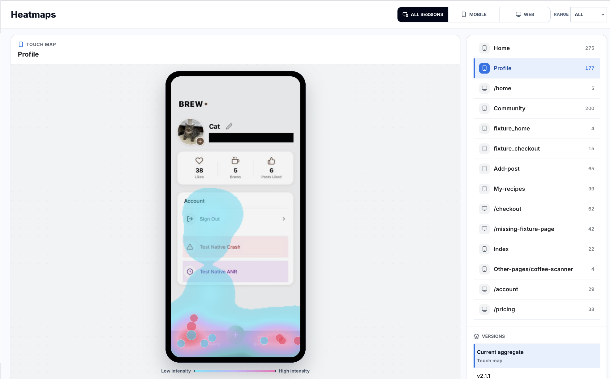
Touch maps are useful when they surprise you
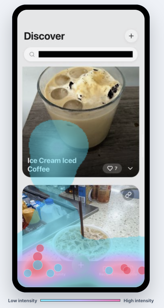
Touch maps answer a narrower question: where did users put their fingers, tap, or click? On mobile, that is still valuable for dead zones, repeated taps, thumb reach, bottom navigation friction, gesture confusion, and controls that look interactive but do nothing.
The signal becomes interesting when touches cluster on a non-control, repeat after no feedback, or appear where the UI should have guided the user somewhere else. A map full of red around primary buttons is mostly proof that the UI has primary buttons.
- Look for repeated taps on disabled, loading, or non-interactive UI.
- Check whether users tap labels, cards, images, or empty areas that look tappable.
- Pair touch hotspots with replay before filing a ticket.
Open replay before writing the ticket
A heatmap shows the population pattern. Replay explains the individual moment. When attention pools around the wrong content or touch events cluster on a confusing control, open sessions from the same route, screen, version, device, and outcome.
That keeps the engineering handoff concrete. Instead of reporting that a map is red, the ticket can say users skimmed the hero copy, missed the installation callout, repeatedly tapped a non-interactive card, or reached the CTA only after a failed request changed state.
- Attach the map type: web attention map or mobile touch map.
- Attach the selected route, screen, release, device, and segment.
- Include at least one replay that shows the behavior before and after the hotspot.
- State whether the likely fix is copy, layout, feedback, interaction, or instrumentation.
Use heatmaps after a release
Heatmaps are especially useful after a change ships. On web, compare whether attention moved toward the intended headline, form, callout, or CTA. On mobile, compare whether repeated taps moved away from confusing areas and toward responsive controls.
If attention improves but conversion does not, the problem may be trust, pricing, performance, backend reliability, or the next step in the journey. If conversion improves without a visible attention shift, the fix may have removed friction rather than changed what people read.
- Compare the same route or screen before and after the release.
- Separate web attention movement from mobile touch movement.
- Check journeys and replay when the heatmap improves but the outcome does not.
Implementation notes
These are the checks another engineer should be able to use before trusting the feature in production.
- Keep product language precise: attention maps are web-only; touch maps are interaction maps.
- Label routes and screens consistently so maps can be compared across releases.
- Use touch maps for taps, repeated taps, dead zones, reachability, and gesture friction.
- Use attention maps for skimmed copy, ignored callouts, missed sections, and content hierarchy problems.
- Attach replay samples before turning a heatmap hotspot into an engineering ticket.
- Mask sensitive page and screen regions before sharing heatmap screenshots broadly.
When to use a lighter signal
- You only need tap density on a mobile screen.
- You are not evaluating copy, scroll depth, content exposure, or web page comprehension.
- You do not plan to open replays from the same route or release before filing tickets.
Questions teams usually ask
What is the difference between attention maps and touch maps?
Attention maps are web-only maps that help show what page content users noticed, skimmed, or ignored. Touch maps show where users tapped or touched, especially on mobile screens.
Why are attention maps more useful for web pages?
Web pages have reading order, scroll depth, hero copy, docs sections, pricing blocks, and content exposure. Attention maps can reveal whether those areas carried the user's focus, while touch maps often turn obvious buttons red.
When should I use mobile touch maps?
Use touch maps to find repeated taps, dead zones, gesture confusion, crowded controls, and mobile navigation friction. Pair them with replay before treating a hotspot as a product problem.
Related reading
- Revenue leak guide: See how to find checkout, onboarding, paywall, and subscription leaks before they compound.
- Pricing: See fixed plans for revenue-leak prediction across web and mobile apps.
- Live demo: Open the demo dashboard and inspect the replay, heatmap, journey, and stability views.
- React Native SDK: Install mobile session replay for React Native and Expo apps.
- Web SDK: Add browser session replay, analytics, and network capture to a web app.
Sources
- Nielsen Norman Group: F-Shaped Pattern of Reading on the Web
- Nielsen Norman Group: Original F-Pattern eyetracking research
- Chartbeat: User Engagement Tracking Methodology
- Chartbeat: Using Engaged Time to understand your audience
- Chen, Anderson, and Sohn: eye/mouse movement correlation
- Huang, White, and Dumais: No Clicks, No Problem
- Huang, White, and Buscher: Gaze and Cursor Alignment
- Rayner: Eye movements in reading and information processing