
Most product analytics tools are very good at proving that something happened.
A user signed up. A user opened a screen. A user clicked the upgrade button. A user reached checkout. A user invited a teammate. A user returned on day 7. A user churned.
That is useful. It is also incomplete.
The hardest product questions are not usually about whether an event happened. They are about the moment around the event:
- What did the user see before they clicked?
- Did the page look loaded, broken, or unfinished?
- Did the tap feel ignored?
- Did the user hesitate, loop, rage click, or backtrack?
- Did an API error, slow request, crash, or device issue change the outcome?
- Did the user understand the next step?
- Did the user complete the event but still leave confused?
That is where a normal product analytics platform starts to feel thin. Events, funnels, cohorts, and dashboards can point at a problem. They rarely show the product moment clearly enough to fix it.
Rejourney's point of view is simple:
The event tells you what happened. The moment tells you why.
Why product analytics tools are still necessary
This is not an anti-analytics argument. Product analytics tools are necessary because teams need a shared measurement layer.
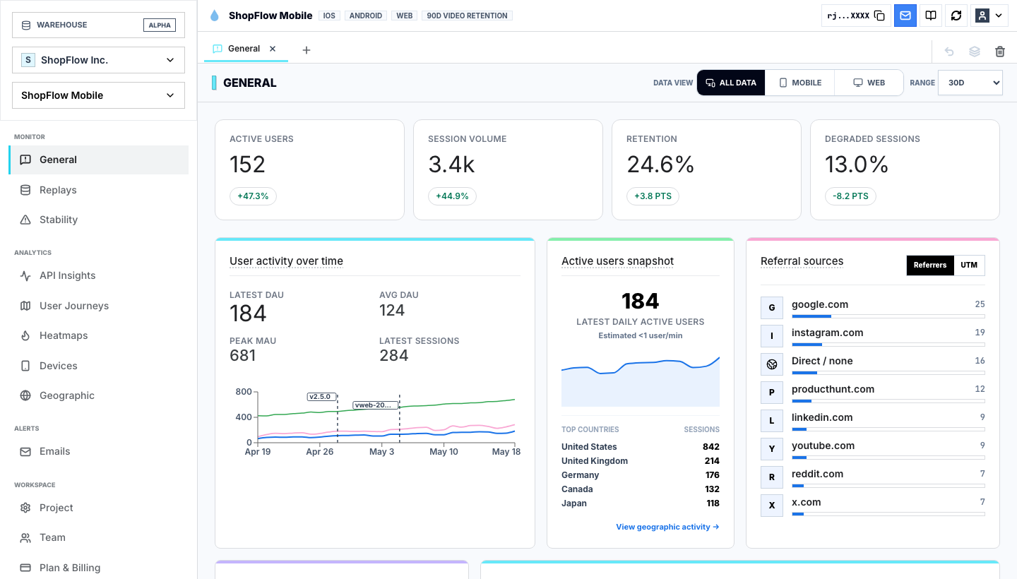
You still need to know:
| Analytics question | Why it matters |
|---|---|
| How many users reached a screen or action? | Shows adoption and feature reach. |
| Where do users drop from a funnel? | Shows which step deserves investigation. |
| Which cohorts retain? | Shows whether product value compounds over time. |
| Which acquisition sources convert? | Shows where growth is coming from. |
| Which devices, app versions, or segments behave differently? | Shows where the average is hiding a local issue. |
Without this layer, teams drift into anecdotes. Sales remembers one complaint. Support remembers one ticket. Design remembers one usability test. Engineering remembers one bug. Product analytics gives everyone the same map.
But a map is not the same thing as evidence.
If a funnel says the product detail page loses users before cart, the team still needs to know what actually happened on that screen. Did users miss the CTA? Did the image shift? Did inventory arrive late? Did the add-to-cart request fail? Did users open reviews, then size guide, then leave? Did mobile users tap the wrong region because the button was too low?
That is the gap between analytics and product repair.
The missing layer is session evidence
The best product analytics software should not stop at event names. It should let a team move from aggregate signal to individual evidence without losing context.
The workflow should feel like this:
- See a metric move.
- Segment the users who created the movement.
- Open the sessions behind that segment.
- Watch the exact product moments.
- Group the repeated friction patterns.
- Ship the smallest fix.
- Verify that the metric changed for the same cohort.
Session replay analytics is what makes that loop real. The replay does not replace the event. It explains the event.
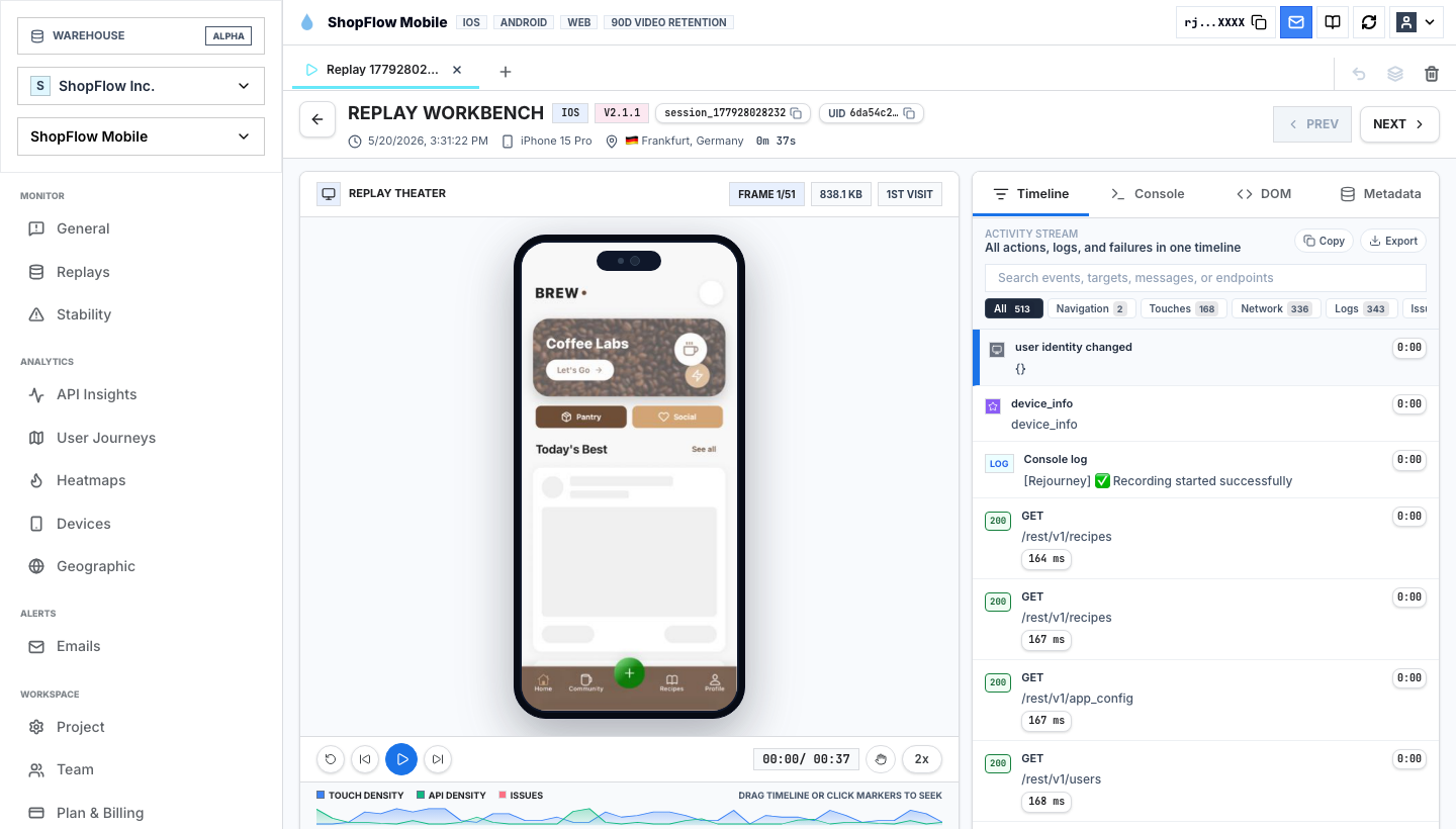
In the replay above, the event stream says a user navigated, loaded APIs, touched the screen, and interacted with the app. The session view shows the actual experience: screen state, mobile context, API calls, touch timeline, rage taps, and DOM structure.
That matters because two users can produce the same event sequence and have completely different experiences.
| Event sequence | Possible real moment |
|---|---|
view_product -> add_to_cart | Smooth purchase intent. |
view_product -> add_to_cart | User tapped twice because the first tap had no feedback. |
signup_started -> signup_completed | Clean activation. |
signup_started -> signup_completed | User fought validation, barely finished, and never returned. |
invite_sent | Collaboration started. |
invite_sent | User guessed through unclear permissions and created support risk. |
search -> result_clicked | Discovery worked. |
search -> result_clicked | User picked the least bad result after several failed searches. |
Product analytics tools are strongest when the event is connected to the surrounding moment.
Funnels show where. Replay shows why.
Funnels are one of the most useful features in product analytics. They answer a clean question: how many users progressed from one step to the next?
But funnel drop-off is not always located at the step where the chart shows loss. The user can lose confidence earlier and abandon later.
For example:
| Funnel drop | Real cause to check |
|---|---|
| Checkout payment | Shipping cost appeared late, then payment felt risky. |
| Signup verification | Email copy was unclear, and users did not know whether to leave the app. |
| Invite teammate | Role permissions were confusing before the invite form. |
| Mobile onboarding | Permission prompt appeared before value was explained. |
| Product activation | The success state looked too similar to the loading state. |
A product analytics dashboard can rank these steps by volume and drop-off. Rejourney should then make it easy to open the replay samples from the exact cohort.
The practical question is not just "where is the biggest drop?"
The better question is:
Which dropped sessions contain the clearest repeated friction pattern?
That pattern is what the team can fix.
Journey analytics catches the path around the event
Events are points. Journeys are paths.
That distinction matters because users rarely behave like a clean funnel diagram. They detour, loop, retry, compare, open settings, search, return, change tabs, hit errors, and sometimes complete the target action in a way that still predicts churn.
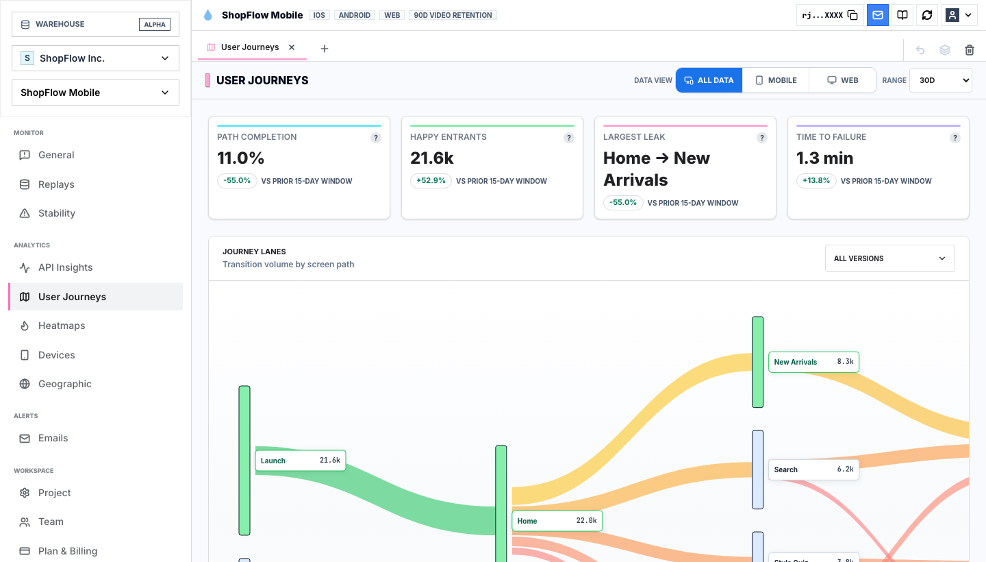
User journey analytics helps answer questions that event dashboards often flatten:
- What do users do before the funnel starts?
- What detours happen before conversion?
- Which loops happen before churn?
- Which screens receive traffic because users are confused, not because they are interested?
- Which path looks healthy in aggregate but degraded for a device, region, app version, or acquisition source?
A product analytics platform might show that profile_viewed is common. Journey analytics can show whether profile is a healthy destination or a panic route users take when they cannot complete something else.
That is why path context belongs beside events. A page view is not always attention. Sometimes it is confusion.
Heatmaps show what the interface taught the user
Product analytics measures declared behavior. Heatmap analytics shows visual behavior.
That matters because users do not interact with your event taxonomy. They interact with pixels, motion, layout, copy, disabled states, buttons, cards, and loading feedback.
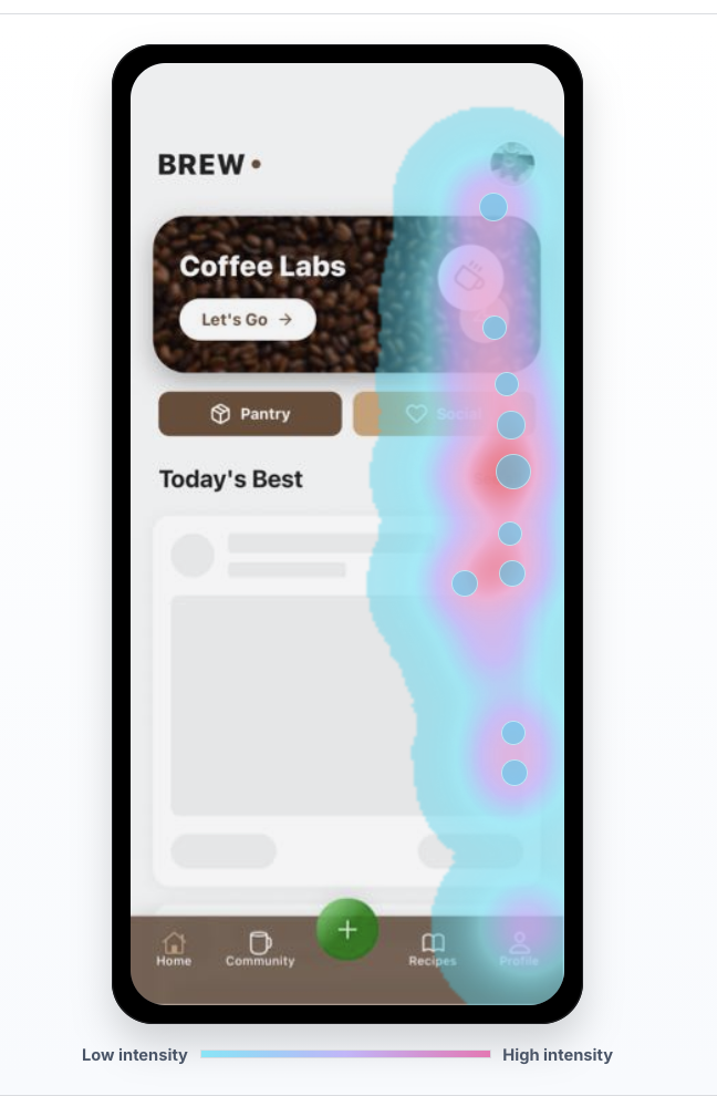
Heatmaps are especially useful when the product technically works, but the interface teaches the wrong action.
Look for:
- Taps on elements that are not interactive.
- High attention on secondary actions.
- Users missing the primary CTA.
- Touch clusters near, but not on, the button.
- Scroll depth that hides the context users need before deciding.
- Taps around loading states.
- Repeated interaction near validation, pricing, or permission copy.
The heatmap alone is not the answer. It is the visual lead.
The best workflow is:
- Find a funnel or cohort problem.
- Open the heatmap for the relevant screen.
- Identify suspicious clusters.
- Jump into sessions from that screen and segment.
- Confirm whether the behavior caused friction.
That keeps heatmaps from becoming pretty artifacts in a slide deck.
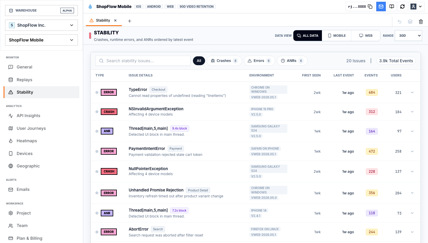
Mobile app analytics needs technical context
Mobile product analytics has a special problem: the user's product experience is shaped by device, OS, app version, screen size, network quality, memory pressure, gestures, keyboards, permission prompts, backgrounding, crashes, ANRs, and native SDK behavior.
If the dashboard only shows events, the team can miss the actual reason the user left.
A mobile app analytics report should make it easy to ask:
| Mobile question | Evidence needed |
|---|---|
| Did users abandon because of UX or performance? | Replay, latency, slow screens, API timing, and rage taps. |
| Did one app version create a regression? | Version segmentation plus issue trends. |
| Did the crash happen near intent? | Crash context attached to the session timeline. |
| Did users fight the UI before leaving? | Touch stream, heatmaps, dead taps, rage taps. |
| Did a specific device model behave differently? | Device, OS, screen, crash, and replay evidence. |
This is where Rejourney should separate itself from generic product analytics tools. Mobile teams do not only need more events. They need the event, the replay, the device, the issue, and the user journey in the same investigation.
Issues turn analytics into prioritization
The moment between events often contains technical signals: crashes, errors, rage clicks, slow screens, API failures, and performance regressions.
Those signals are not separate from product analytics. They are product analytics with consequences.
An issue feed becomes much more useful when every issue can be tied back to user behavior:
| Signal | Product question |
|---|---|
| Rage clicks | Which conversion or activation step did users fight? |
| API errors | Did the user know whether the action worked? |
| Crashes | Was the crash near a high-intent moment? |
| ANRs | Did the app feel frozen before the user left? |
| Slow screens | Did latency change conversion or retention? |
| Version regressions | Did one release create a measurable behavior shift? |
The goal is not to collect every signal. The goal is to prioritize the signals that explain lost behavior.
How to evaluate product analytics tools
If a team is comparing product analytics tools, I would not start with the longest feature grid. I would start with the investigation loop.
Ask each tool:
- Can we define funnels, cohorts, retention, and segments without ceremony?
- Can we open the sessions behind a metric?
- Can we see the journey path before and after the event?
- Can we inspect heatmaps for the affected screen?
- Can we filter by rage clicks, dead taps, crashes, API errors, app version, device, country, and slow sessions?
- Can engineering, product, design, and support share the same evidence?
- Can we verify whether a fix changed the same cohort?
If a product analytics tool cannot move from metric to moment, the team will still need another workflow to figure out what to ship.
That workflow usually becomes messy: a dashboard in one product, crash reports in another, recordings somewhere else, support tickets in a third place, and a spreadsheet trying to connect all of it.
The Rejourney way to do product analytics
Rejourney should not try to sound like every other product analytics platform.
The stronger message is:
Product analytics should start with events, but it should end with evidence.
The event says the user clicked. The replay shows whether the click worked.
The funnel says users dropped. The journey shows where they detoured.
The cohort says users churned. The issue feed shows whether they hit rage clicks, slow screens, errors, or crashes first.
The heatmap says users touched the screen. The replay shows what they were trying to do.
That is the practical difference. Teams do not need another dashboard that stops at "what happened." They need an analytics workflow that helps them decide what to fix.
Product analytics tools show the event. Rejourney shows the moment.