
Most teams do not have a funnel problem because they cannot calculate conversion rate. They have a funnel problem because the number stops at the least useful moment.
A checkout funnel says 38% of users abandoned the payment step. A signup funnel says the email verification screen leaks half the traffic. A mobile onboarding funnel says users reach permission prompts and vanish. That is useful, but only barely. It tells the team where the product lost people. It does not explain what those people saw, what they tried, what failed, or whether the same friction will also hurt retention after the first session.
Good conversion funnel analytics should answer a sharper question:
Which product moments create enough confusion, delay, or broken feedback that users decide not to continue?
That requires more than a chart. It requires product analytics for measurement, user journey analytics for path context, heatmap analytics for visual behavior, rage click tracking for frustration signals, and session replay for evidence. When those signals live together, funnel analysis stops being a dashboard review and becomes a product repair workflow.
What this funnel topic actually includes
The real search and product intent around this topic is not only "funnels." The stronger cluster combines analytics, journeys, heatmaps, and retention:
| Topic angle | Why it matters |
|---|---|
| conversion funnel analytics | The core job: understand where and why users drop from a goal path. |
| product analytics | The broader category people use when they want events, cohorts, funnels, and retention. |
| user journey analytics and customer journey analytics | The path-level view: what users do before, during, and after the funnel. |
| heatmap analytics and website heatmap | The visual evidence: where users click, hesitate, scroll, and ignore. |
| rage click tracking | The frustration signal: repeated clicks, dead taps, broken controls, or unclear feedback. |
| retention metrics and user retention | The business outcome: fixing the funnel should increase future usage, not only one-step completion. |
The best article, page, or feature narrative should not be "we have funnels." Many tools have funnels. The stronger angle is:
Use analytics to turn funnel drop-off into a prioritized friction list, then verify that the fix improves conversion and retention.
That is the gap between a reporting tool and a workflow a product team can act on.
Start with a funnel that describes user intent
Bad funnels are usually event lists copied from implementation details:
page_viewbutton_clickedmodal_openedrequest_sentsuccess
That might be accurate, but it is not how a user thinks. A better funnel names the promise the product is making:
- User understands the offer.
- User starts the action.
- User provides the required input.
- User sees progress.
- User receives confirmation.
- User returns or continues to the next valuable action.
This framing matters because friction is often not the final failed step. It starts earlier. A user may abandon checkout at payment, but the real problem may be unclear shipping costs on the previous screen. A user may drop on an invite form, but the real problem may be that permissions were not explained before the form appeared. A mobile user may skip a core feature after onboarding because the first session created uncertainty.
Conversion funnel analytics should measure the sequence, but the sequence should be written in product language.
Measure drop-off, then immediately ask why
The first layer is still quantitative. You need to know the largest leaks:
| Funnel question | Useful metric |
|---|---|
| Where do users leave? | Step conversion rate and drop-off rate |
| Who leaves? | Segment by device, browser, country, plan, acquisition source, app version, and new vs returning user |
| When do they leave? | Time to next step, hesitation time, retry count |
| What happened nearby? | API errors, validation errors, crashes, ANRs, slow requests, rage clicks |
| Did the fix matter? | Conversion lift, retained users, cohort retention, repeated action rate |
But the chart is only the index. The work begins when a team clicks into the failing step and asks:
- Did users understand what to do next?
- Did the UI acknowledge their action?
- Did a required field fail without clear feedback?
- Did the page or screen look complete before the data was ready?
- Did an API error make the product feel broken or ambiguous?
- Did mobile users hit a keyboard, safe-area, gesture, or permission problem?
- Did users rage click, dead tap, loop between screens, or reopen the same panel?
This is where product analytics needs behavioral context.
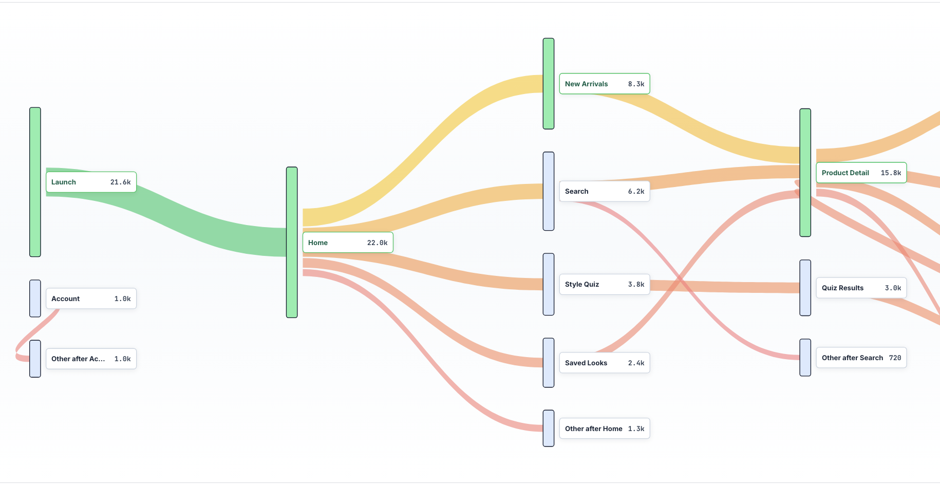
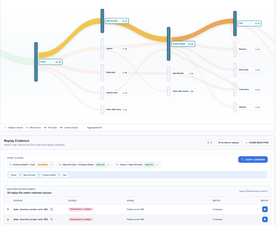
Use user journey analytics to find the paths around the funnel
A funnel is a narrow path. A user journey is the surrounding street map.
That distinction is important because many users do not fail a funnel by simply dropping out. They detour. They open pricing. They visit docs. They go back to settings. They search help. They change tabs. They close and return later. They retry the same action three times.
User journey analytics helps identify whether the funnel is really failing at the labeled step or whether users are taking alternate routes because the intended path is unclear.
For example:
- A signup funnel may leak after "create workspace," but journey analytics may show users bouncing between workspace creation and invite permissions.
- A mobile purchase funnel may leak on "confirm payment," but journeys may show users checking plan limits right before that step.
- A B2B demo funnel may leak on "submit form," but journeys may show users opening security docs, pricing, and privacy pages in the same session.
- A product onboarding funnel may leak after "connect integration," but journeys may show users repeatedly visiting settings because the success state is not obvious.
When journey analytics is connected to replay, the team can inspect the actual moments behind those paths instead of guessing from event names.
For cart abandonment, the useful question is not only "how many users reached the cart?" It is "which path to cart is degraded, and what replay evidence proves it?" In the example below, the journey query follows Home -> New Arrivals -> Product Detail -> Cart, marks the Product Detail -> Cart transition as degraded, and opens replay samples from users who matched the same path. That turns cart abandonment from a percentage into a review queue.
Use heatmaps to see what the funnel is visually teaching users
Heatmap analytics is useful when the problem is not a broken event. Sometimes the product works as designed, but the layout teaches the wrong thing.
Look for:
- Primary actions receiving less attention than secondary actions.
- Clicks on text, images, or disabled controls that users think are interactive.
- Scroll depth that shows important context is below the point where users decide.
- Mobile taps clustered near a control but not on it, which can signal sizing or layout issues.
- Repeated clicks around loading states, which can signal missing feedback.
- Attention drifting to pricing, legal, or help links right before conversion.
Heatmaps are especially useful for landing pages, signup pages, plan selection, checkout, onboarding, and settings screens. They are less useful as a standalone answer. A heatmap tells you what many users touched. Replay tells you what happened in the individual session. Events tell you how often it matters.
The useful workflow is:
- Find the funnel step with the largest meaningful drop.
- Segment to the cohort where the drop is worst.
- Open the heatmap for that screen or page.
- Identify suspicious behavior clusters.
- Jump into sessions from those clusters.
- Confirm whether the behavior caused confusion, delay, or abandonment.
This keeps heatmaps from becoming pretty pictures that never turn into shipped fixes.
Treat rage clicks as a funnel alarm
Rage click tracking is one of the highest-signal friction tools because it captures intent colliding with failure.
A rage click in a funnel usually means one of five things:
- The user clicked a control that looked enabled but was not.
- The product accepted the click but gave no visible feedback.
- A request failed silently or slowly.
- The user expected the interface to navigate, expand, or submit.
- Validation blocked progress without explaining what to fix.
Rage clicks should be ranked by funnel impact, not raw count. Ten rage clicks on a low-value settings panel may matter less than three rage clicks on the final checkout button.
The best report is not "rage clicks by page." The better report is:
| Friction signal | Funnel context |
|---|---|
| Rage clicks on primary CTA | Which funnel step, which segment, how many lost conversions |
| Dead taps on mobile | Which screen size, OS, app version, and gesture pattern |
| Repeated validation errors | Which field, which copy, which drop-off rate |
| API errors before abandonment | Which endpoint, status code, latency, and user action |
| Back-and-forth loops | Which two screens, how often, and whether users return |
This turns rage click tracking into product prioritization.
Connect funnel analytics to retention
Conversion is not the finish line. A funnel can improve today while damaging retention tomorrow.
For example:
- A shorter onboarding flow may increase first-session completion but reduce activation quality.
- A forced trial prompt may lift signup conversion but create more dead accounts.
- Removing a setup step may reduce friction but leave users confused in their second session.
- A discount may improve checkout conversion but lower repeat purchase intent.
This is why retention metrics belong in funnel analysis. Every major funnel fix should be checked against downstream behavior:
| Funnel | Retention metric to watch |
|---|---|
| Signup or onboarding | Day 1, day 7, and first valuable action completion |
| Checkout | Repeat purchase, refund, support contact, subscription continuation |
| Invite or collaboration | Activated teammates, shared workspace activity, second-session return |
| Integration setup | Successful data flow, feature usage after setup, support tickets |
| Mobile permission prompt | Feature usage, opt-in recovery, uninstall or dormant rate |
The question is not only "did more users complete the funnel?" It is "did more users reach the reason they came here and come back?"
Build a friction score so the team knows what to fix first
Funnels generate too many possible fixes. A friction score helps avoid random prioritization.
One simple model:
friction_score = affected_users x step_value x confidence x severityWhere:
affected_usersis the number of users who hit the pattern.step_valueis the business value of the funnel step.confidenceis higher when analytics, heatmaps, rage clicks, and replay all agree.severityis higher for abandonment, failed payment, failed signup, lost data, or broken trust.
You can also subtract effort if you want a more practical score:
priority = friction_score / estimated_fix_effortThis prevents a team from spending a sprint on an interesting UX issue that affects 12 users while ignoring a boring validation bug that costs hundreds of conversions.
A practical workflow for finding funnel friction
Here is the workflow we like:
1. Pick one funnel and one outcome
Do not start with every funnel. Pick one:
- Visitor to signup.
- Signup to activation.
- Trial to paid.
- Onboarding to first project.
- Invite sent to teammate joined.
- Checkout started to purchase complete.
Then pick the outcome that matters. For many products, the best outcome is not the final button. It is the first durable value moment after the button.
2. Instrument the path in plain language
Name events like product moments:
signup_startedworkspace_createdinvite_step_seeninvite_sentfirst_session_recordedfirst_replay_viewedAvoid event names that only describe code internals. The analytics event should be readable by product, engineering, design, and support.
3. Segment before you interpret
Overall funnel conversion hides the real story. Always split by:
- New vs returning users.
- Mobile vs desktop.
- Browser and OS.
- App version.
- Acquisition source.
- Country or region.
- Plan, role, or permission level.
- Feature flag or experiment.
Many funnel problems are not universal. They are specific to a platform, region, lifecycle stage, or user type.
4. Attach friction signals to every step
For each funnel step, track:
- Rage clicks.
- Dead taps.
- Validation errors.
- API errors.
- Latency.
- Crashes and ANRs.
- Back navigation.
- Repeated attempts.
- Session replay links.
This lets the team move from "payment step dropped 21%" to "iOS users on version 2.3 hit a silent 422 response after tapping Apply Coupon, then rage tapped and abandoned."
That sentence is fixable.
5. Watch sessions from the worst cohort
Do not watch random sessions. Watch sessions from the segment with the highest loss and the clearest friction signal.
Good filters:
- Dropped at step three.
- Rage clicked on the CTA.
- Had an API error within 30 seconds of drop-off.
- Used mobile Safari.
- Returned to the previous screen twice.
- Failed validation more than once.
Replay is most valuable when analytics narrows the search.
6. Ship the smallest fix that closes ambiguity
Many funnel fixes are not redesigns. They are clarity repairs:
- Show loading feedback immediately.
- Keep the CTA disabled until required fields are valid.
- Explain why a button is disabled.
- Preserve user input after an error.
- Replace vague errors with next steps.
- Move cost, time, or permission context earlier.
- Confirm success in language the user understands.
- Retry failed requests and explain state when retry fails.
Ambiguity is often more damaging than the underlying technical failure. If the user knows what happened and what to do next, they are more likely to continue or return.
7. Verify with conversion and retention
After shipping the fix, compare:
- Step conversion.
- Time to next step.
- Rage clicks per session.
- Validation errors per user.
- API errors near the funnel.
- Support tickets about the same action.
- Day 1, day 7, or repeat-action retention.
If conversion improves but retention gets worse, the fix may have made the funnel easier without making the product more valuable.
What teams get wrong
They optimize the biggest drop without checking intent
The biggest drop is not always the biggest problem. Some users should drop because they are unqualified, on the wrong plan, or not ready. The best funnel fixes focus on users who wanted to continue but hit avoidable friction.
They use product analytics without replay
Product analytics tells you what happened. Replay shows how it happened. Without replay, teams debate causes from event names. With replay, they can watch the actual confusion.
They use replay without analytics
Replay without analytics becomes anecdote hunting. A painful session might be rare. A boring session might represent thousands of users. Analytics tells the team which recordings matter.
They stop at conversion
A product can push users through a funnel and still lose them later. Retention metrics are the guardrail. Funnel work should make users more successful, not just more processed.
The Rejourney way to do it
Rejourney is built for this combined workflow:
- Product analytics to find the drop.
- Journeys to see the paths around the drop.
- Heatmaps to see what the UI is teaching.
- Rage clicks and dead taps to detect frustration.
- Session replay to inspect the real user experience.
- API, crash, and performance context to connect UX friction to technical causes.
The important part is not that these features exist. The important part is that they are connected. A funnel chart should open the exact sessions that explain the drop. A rage click should show the API request nearby. A heatmap cluster should lead to replays from users who abandoned. A retention cohort should tell you whether the fix created durable value.
That is how analytics improves funnels: not by making the chart prettier, but by making the next product decision obvious.