
Churn is usually treated like a finance metric. A team opens a dashboard, sees that 8.7% of users left, compares it to last week, and then starts arguing about onboarding, pricing, lifecycle emails, activation, bugs, support, and whether the cohort was weird.
That conversation is not wrong. It is just too late.
Churn is not the moment a user disappears from a chart. Churn is the accumulated story of smaller product moments where the user lost confidence. A slow screen. A dead tap. A confusing route through the product. A payment button that felt broken. A crash at the exact point of intent. A rage click that never became a support ticket. A regional performance problem that only shows up for users far from your default test environment.
Retention metrics tell you who stayed. Churn analysis should tell you why someone decided not to.
The SEO data around this topic is split between broad definitions like churn, practical comparisons like churn rate vs retention rate, and measurement terms like user retention, retention metrics, customer retention metrics, and mobile app retention analytics. That search pattern says something useful: people do not only want a formula. They want to connect the formula to product behavior.
That is exactly where Rejourney should have a strong point of view:
Every churned user leaves evidence before they leave. The job is to preserve that evidence, group it, and turn it into a fix list.
Churn starts before the churn event
A churn event is often defined as a user who did not return within a certain window. For a consumer app, that might be no return in 7 days. For a SaaS product, it might be subscription cancellation, workspace inactivity, or no meaningful usage after signup. For ecommerce, it might be abandoned checkout plus no repeat visit.
That definition is useful for reporting. It is not enough for product work.
The decision usually happens earlier:
| What the dashboard sees | What the user experienced first |
|---|---|
| The user did not return | The app felt slow twice in a row. |
| The user cancelled | A workflow failed and support was too much effort. |
| The user abandoned checkout | The cart path looked complete, but the next step gave no feedback. |
| The user never activated | Onboarding explained the setup step, but not the reason it mattered. |
| The user stopped inviting teammates | Permissions, roles, and success states were unclear. |
This is why churn needs behavioral evidence. A retention curve can show the drop. A cohort table can show which users are affected. Product analytics can show the events around the loss. But session replay, heatmap analytics, rage click tracking, crashes, API errors, and performance context are what turn that loss into a story the team can repair.
Churn rate vs retention rate is the wrong argument
Teams often ask about churn rate vs retention rate as if one is the correct metric and the other is optional.
They are mirrors.
Retention rate asks: what percentage of users came back or continued?
Churn rate asks: what percentage of users stopped coming back or cancelled?
Both are useful, but neither explains the product behavior that caused the change. The better question is:
Which friction patterns separate retained users from churned users?
That question moves the team from accounting to diagnosis. Instead of saying "mobile retention is down," the team can say:
- Android users on version 2.5.0 who hit a crash in product cards returned less often.
- Users in Southeast Asia saw higher latency and had more incomplete purchase sessions.
- Users who rage tapped the primary CTA were less likely to finish onboarding.
- Users who reached the profile tab after browsing products often looped without completing the next action.
- Users who experienced an API failure and no visible recovery message had fewer future sessions than users who crashed and reopened.
That is the level where product teams can act.
A churn story has four kinds of evidence
Good churn analysis needs at least four evidence layers.
| Evidence layer | What it answers |
|---|---|
| Retention metrics | Who left, who stayed, and when the difference appeared. |
| Journey paths | What users did before the drop, including detours and loops. |
| Visual behavior | Where users clicked, tapped, hesitated, scrolled, or ignored. |
| Technical context | Whether crashes, slow requests, API errors, device models, app versions, or latency created friction. |
When these layers are separate, churn becomes a meeting full of guesses. When they are connected to replay, churn becomes a review queue.
You are no longer asking "why did users leave?" in the abstract. You are asking "what did churned users see in the final sessions before they stopped coming back?"
Regional friction can hide inside average retention
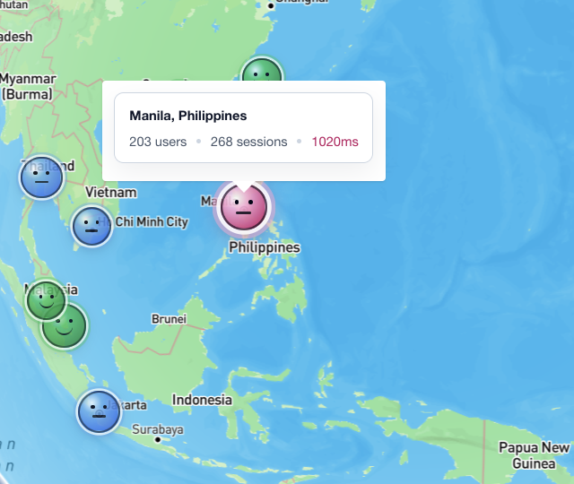
The map screenshot above is a good example. Manila shows 203 users, 268 sessions, and 1020ms latency. That does not automatically mean Manila users churned. It does mean the team should treat location and performance as part of the retention story.
Average performance hides geography. A product can feel instant in the founder's city and sluggish somewhere else. A mobile app can look healthy in aggregate while one region gets slow content, delayed search, broken media, or repeated retries.
For churn analysis, regional performance should be reviewed like this:
- Segment retained and churned users by country, city, device, OS, app version, and network quality.
- Compare latency, failed requests, and slow screen transitions before the churn window.
- Open replays from high-latency sessions that also include abandoned flows.
- Look for user behavior that signals lost confidence: backtracking, repeated taps, waiting, switching tabs, or closing the session.
- Fix the smallest recoverable issue first: loading feedback, retry states, cache strategy, smaller payloads, or clearer status copy.
The important part is not "Manila has latency." The important part is whether that latency changes what users do next.
Heatmaps show what users were trying to do
Churn is often caused by a mismatch between product design and user intent. Heatmaps make that mismatch visible.
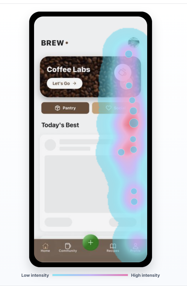
In this example, the heatmap concentrates around the right side of the mobile screen and the lower navigation area. If retention drops after this kind of session, the question is not simply "did the user click?" The better questions are:
- Did users focus on controls that were secondary to the intended action?
- Did they tap a visual element that looked interactive but was not?
- Did they keep looking for a next step after the product thought the screen was done?
- Did the bottom navigation pull attention away from the activation path?
- Did the UI hide the value moment below the visible area?
Heatmap analytics is strongest when paired with replay. A heatmap tells the team where many users touched. Replay shows the sequence: what they saw first, what they tried, whether the product responded, and whether they came back later.
For churn work, the best heatmap question is:
Which visual patterns appear more often in the sessions before users stop returning?
That can reveal a product lesson that the event model missed.
Crashes are not always the worst churn story
Crashes matter. A crash can break trust, block a purchase, lose work, and end the session immediately. If the crash hits the wrong moment, it can become the entire churn story.
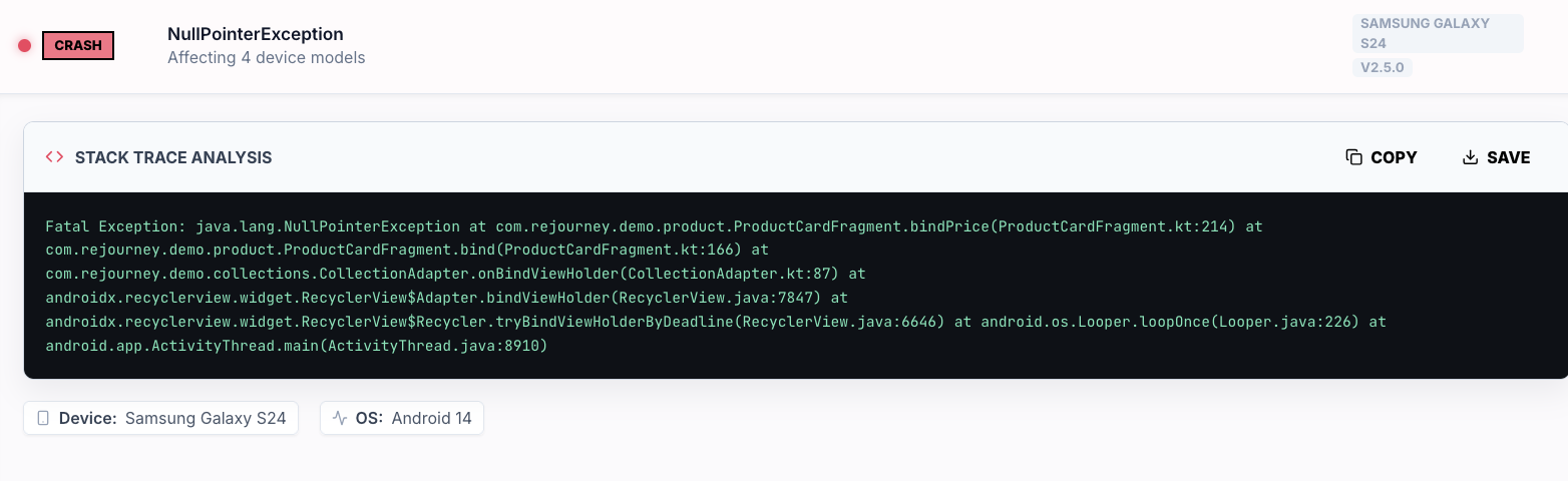
But crashes are visible. A user sees the app close. The recovery path is obvious: reopen it, try again, or leave. That clarity matters.
Ambiguous friction can be worse. A button that accepts taps but never confirms. A form that fails silently. A product detail screen that looks loaded but is missing price data. A checkout step that spins long enough for the user to lose confidence. An API failure that leaves the user wondering whether they paid, saved, booked, or invited someone.
This is why churn analysis should compare visible failures against ambiguous failures:
| Failure type | User interpretation | Churn risk |
|---|---|---|
| Crash | "The app broke." | High, but sometimes recoverable because the event is clear. |
| Slow request | "Maybe the app is stuck." | High when the product gives no status or retry path. |
| API error | "Did my action work?" | Very high when the product leaves ambiguity. |
| Dead tap | "This button does not work." | High when it happens near a conversion or activation step. |
| Rage click | "I know what I want, but the product is blocking me." | High because intent has already turned into frustration. |
The practical move is to tag sessions by failure type, then compare future sessions for each cohort. If users who hit an API error return less often than users who crash and reopen, the team has a stronger retention problem than the crash dashboard alone suggests.
Rage clicks are churn intent in miniature
Rage clicks and rage taps are tiny retention warnings. They capture a user trying to continue and not getting the response they expected.
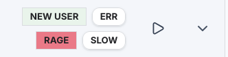
A single rage tap does not always mean churn. It can be harmless. But rage combined with new user status, slow performance, API errors, or a conversion step is different. That combination says the user had intent and the product created resistance.
For retention work, rage click tracking should be attached to user outcomes:
| Signal combination | What to inspect |
|---|---|
| New user + rage | Is onboarding unclear, broken, or visually misleading? |
| Rage + slow | Did the product fail to acknowledge the action quickly enough? |
| Rage + error | Did the user receive a useful recovery path? |
| Rage + checkout | Did the payment, cart, or promo flow block progress? |
| Rage + profile/settings | Was the user trying to fix account, plan, permissions, or notification confusion? |
This is where Rejourney's replay-first workflow is strongest. The team should be able to filter for rage, slow, error, device, app version, and cohort, then watch the exact sessions that created the retention problem.
Build churn cohorts from behavior, not only dates
A retention report usually starts with dates:
- Day 1 retention
- Day 7 retention
- Day 30 retention
- weekly active users
- monthly active users
- subscription cancellation
Those are necessary. But product diagnosis needs behavior-based cohorts too.
Useful churn cohorts include:
| Cohort | Why it matters |
|---|---|
| Users who hit a crash before their second session | Shows whether visible failure blocked early trust. |
| Users who hit a slow screen before activation | Shows whether performance blocked the value moment. |
| Users who rage tapped the main CTA | Shows whether intent was blocked by UI or feedback. |
| Users who looped between two screens | Shows whether the journey lacked a clear next step. |
| Users who saw an API error before checkout or save | Shows whether ambiguity killed confidence. |
| Users who used search but did not select a result | Shows whether discovery failed before conversion. |
Then compare each group to a clean cohort that reached the same product area without the friction signal. That comparison is much more useful than a generic churn percentage.
For example:
clean_new_user_retention = users who reached onboarding step 3 with no issue signalsfriction_new_user_retention = users who reached onboarding step 3 with rage or slow tagsretention_gap = clean_new_user_retention - friction_new_user_retentionThe retention gap tells the team whether the issue is annoying or actually expensive.
A practical churn analysis workflow
Here is the workflow I would use for a product team trying to reduce churn without guessing.
1. Define the churn moment
Pick one churn definition at a time. For example:
- no second session within 7 days
- no activation event within 3 days of signup
- cancelled subscription
- abandoned checkout and no return within 48 hours
- no repeated core action within 14 days
Do not analyze every churn definition at once. Each one has a different story.
2. Find the last meaningful session
For each churned user, find the last session where they showed real intent. That might be the last checkout session, last onboarding attempt, last search, last upload, last invite flow, or last product detail view.
The last meaningful session is usually more useful than the literal final visit. The literal final visit might only be a user checking whether the product improved.
3. Tag the friction
Attach evidence to the session:
- rage clicks or rage taps
- slow screens
- API errors
- crashes
- dead taps
- validation loops
- navigation loops
- device and OS
- app version
- location and latency
- journey path before the failed moment
This creates a vocabulary for churn that product, design, engineering, and support can share.
4. Watch enough replay to name the pattern
Do not watch random replays forever. Watch until the pattern has a name.
"Users are confused" is not a useful pattern.
"New Android users tap the disabled continue button three times because the required field error is below the fold" is useful.
"Checkout is slow" is not enough.
"Users in Manila wait after product detail, tap cart twice, then abandon because add-to-cart has no pending state during a slow request" is useful.
5. Rank by retention impact
Score each pattern by:
priority = affected_users x retention_gap x product_value x evidence_confidence / estimated_fix_effortEvidence confidence should be higher when product analytics, heatmaps, rage clicks, performance, and replay all point to the same issue.
6. Fix the confidence break
Most churn fixes are not giant redesigns. They are confidence repairs:
- show a loading state
- make disabled states explain themselves
- preserve user input after errors
- add a retry path
- make success states unmistakable
- move the next action above the fold
- reduce payload size for slow regions
- fix the crash that hits a high-value action
- explain permission prompts before asking
- turn silent API failures into human-readable recovery
The best churn fix answers the user's hidden question: "Can I trust this product to do what I came here to do?"
7. Verify with retention, not vibes
After the fix ships, watch the same cohort again. Did the friction signal go down? Did completion improve? Did retained users increase? Did the behavior move somewhere else?
If rage clicks drop but retention does not improve, the issue may have been cosmetic. If completion improves but retention drops later, the funnel may have become easier without creating real value. If retention improves for one segment but not another, the product may still have device, region, or version-specific friction.
What teams get wrong
Teams usually make one of four mistakes.
They treat churn like a spreadsheet problem
They calculate the rate accurately, but the number has no replay, journey, heatmap, error, or performance evidence attached. Everyone can see that churn happened. Nobody can see the story.
They optimize activation without checking trust
They shorten onboarding, reduce fields, and push users faster. Sometimes that helps. Sometimes it creates users who completed setup but never understood why they should return.
They separate product analytics from technical signals
Product sees drop-off. Engineering sees crashes and latency. Support sees complaints. Design sees confusing UI. Churn lives across all of them, so the evidence has to live together.
They only watch the loudest failures
Crashes get attention because they are dramatic. Silent failures, dead taps, slow screens, and ambiguous states often cost more retention because the user leaves without telling anyone.
The Rejourney way to do it
Rejourney should talk about churn as an evidence problem.
Not "track churn."
Not "measure retention."
The stronger message is:
Find the friction story behind churn, then watch the sessions that prove it.
That story is built from product analytics, user journey paths, heatmaps, rage click tracking, crash context, API errors, performance, location, device, and session replay. When those signals live in one place, churn stops being a scary number at the end of the month and becomes a set of product moments the team can actually fix.
Users do not churn from a formula. They churn from repeated moments where the product gives them less confidence than the alternative.
Find those moments. Name them. Fix the smallest one that restores trust. Then measure whether users come back.